Bridge is a networking app designed for designers and developers who prefer quiet, intentional ways of connecting. Instead of the loud, fast-paced nature of traditional social platforms, Bridge offers a calmer, introvert-friendly space to discover opportunities, share ideas, and build meaningful professional relationships.
The name "Bridge" is inspired by Saskatoon - the city of bridges - and symbolizes connection, support, and crossing paths with people who share similar goals.
Designers and developers often struggle to find networking spaces that feel calm, genuine, and aligned with how they actually work. Many existing platforms feel overwhelming, noisy, or overly social, which can be discouraging for introverted users or those new to the tech community. Instead of endless feeds and performative posting, there’s a need for a quieter, more intentional space focused on meaningful connection, collaboration, and opportunities.
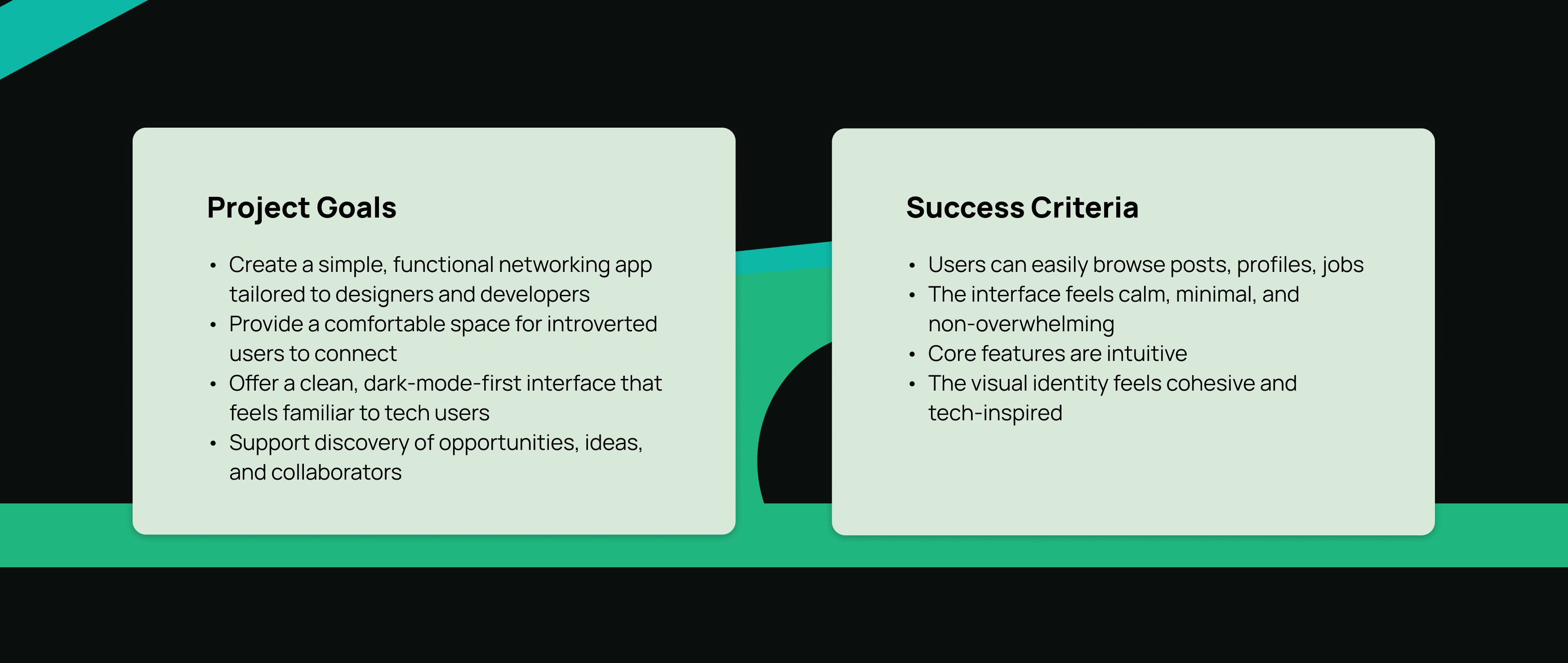
Bridge aims to meet that need by offering a simple, minimal app with only a few essential features, connecting with others, discovering collaboration opportunities, and applying for jobs without the pressure of traditional social platforms.
How to create a networking experience that feels calm, approachable, and supportive for designers and developers who prefer quieter ways of connecting?
Competitive Analysis
To understand common patterns and expectations, I studied several platforms: Reddit, Threads, Facebook, Instagram, LinkedIn, and Handshake.
Conclusion For My App
- Users want a simple way to browse content without distractions
- Dark mode is preferred by many designers and developers
- Too many features can overwhelm new users
- A calm, minimal interface encourages exploration
Exploring User's Scenarios
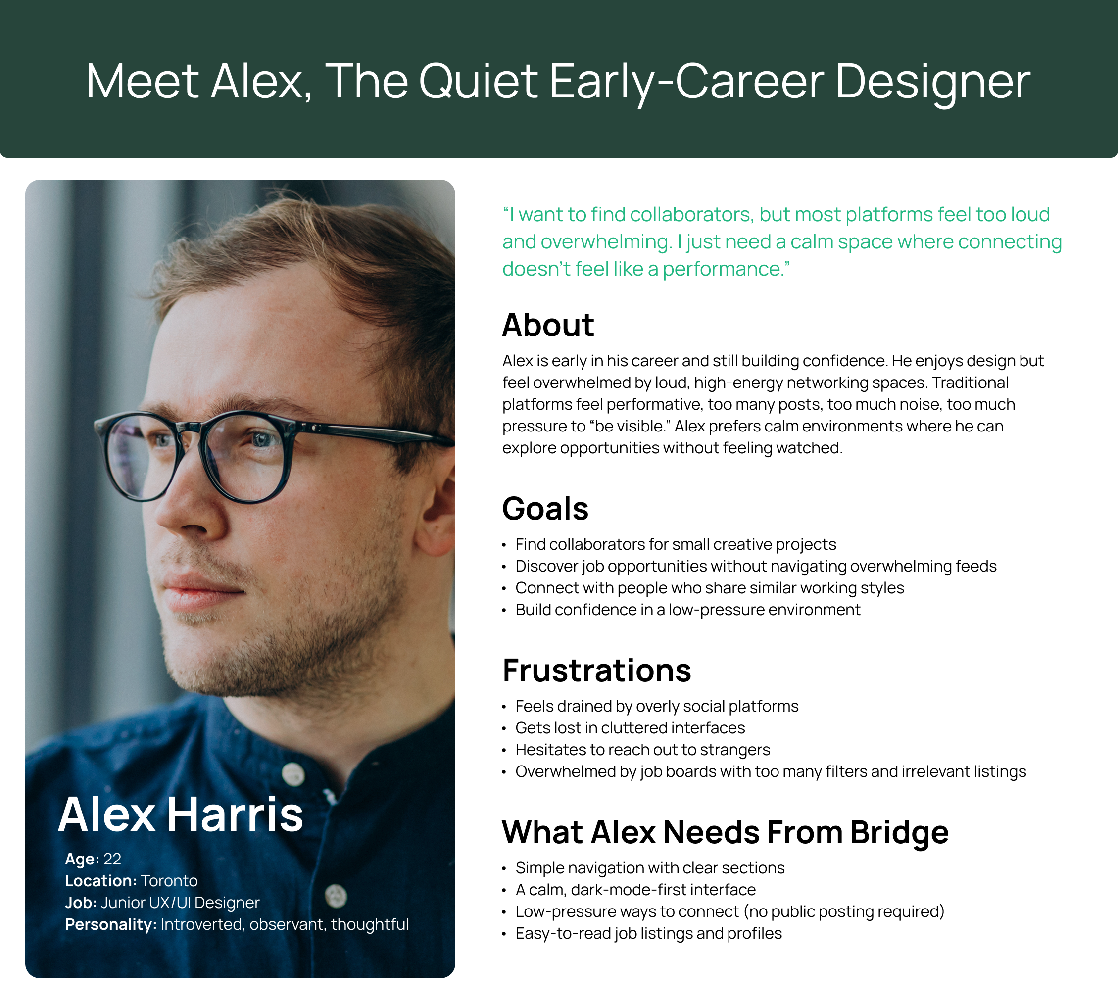
From my research, I noticed clear patterns among introverted designers and developers. Many wanted meaningful professional connection but felt overwhelmed by noisy platforms, unclear navigation, and social pressure. These insights shaped the personas I created for Bridge. I used "How Might We" statements to list some questions and selected the best ones to focus on:
How might we make networking feel calmer and less overwhelming?
How might we help users understand which features support their goals?
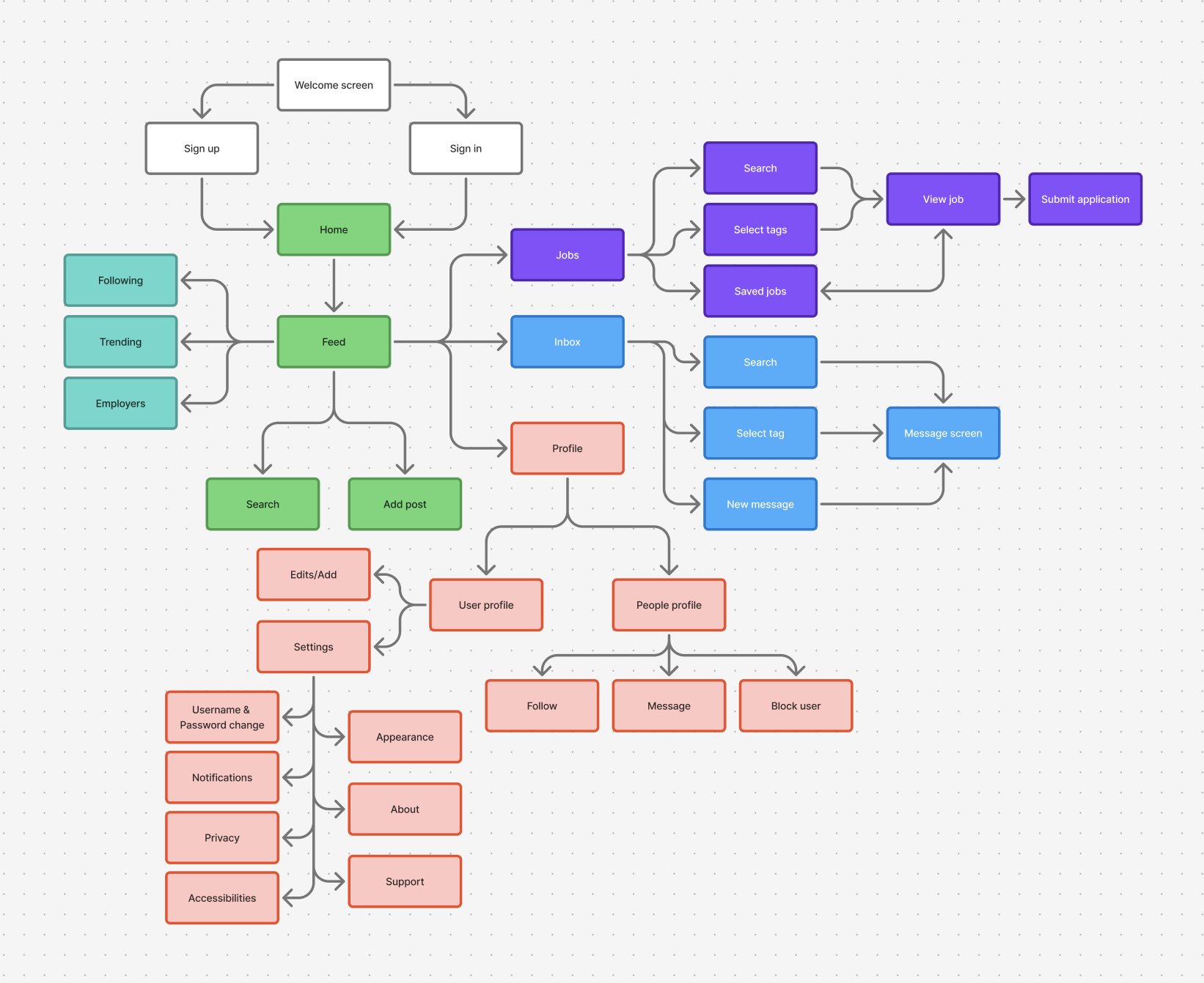
I mapped out the essential flows, keeping navigation predictable and lightweight, reducing cognitive load for introverted or hesitant users.
- Browsing the home feed
- Add a post
- Viewing a profile
- Checking messages
- Job postings tab
- Navigating between tabs
- Accessing settings
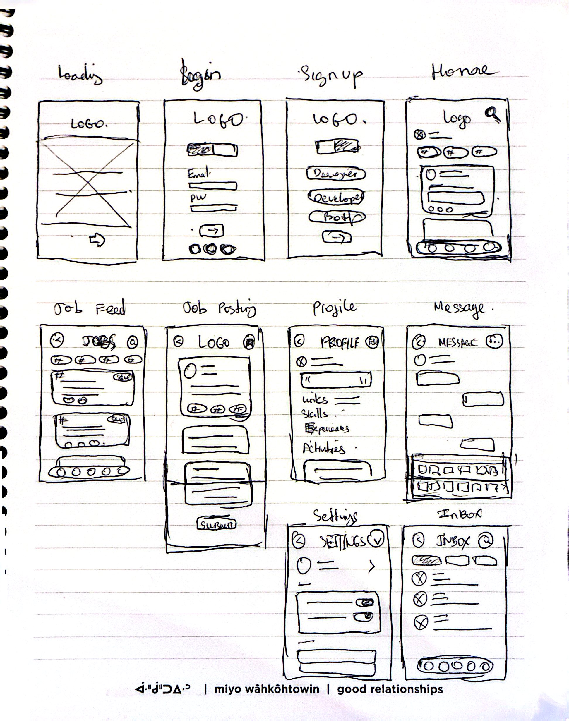
Low-fidelity sketches helped me explore layout options for the feed, profile structure, navigation bar, messaging, job site, and settings before committing to visual design.
Sorry for my very bad quality hand drawing.
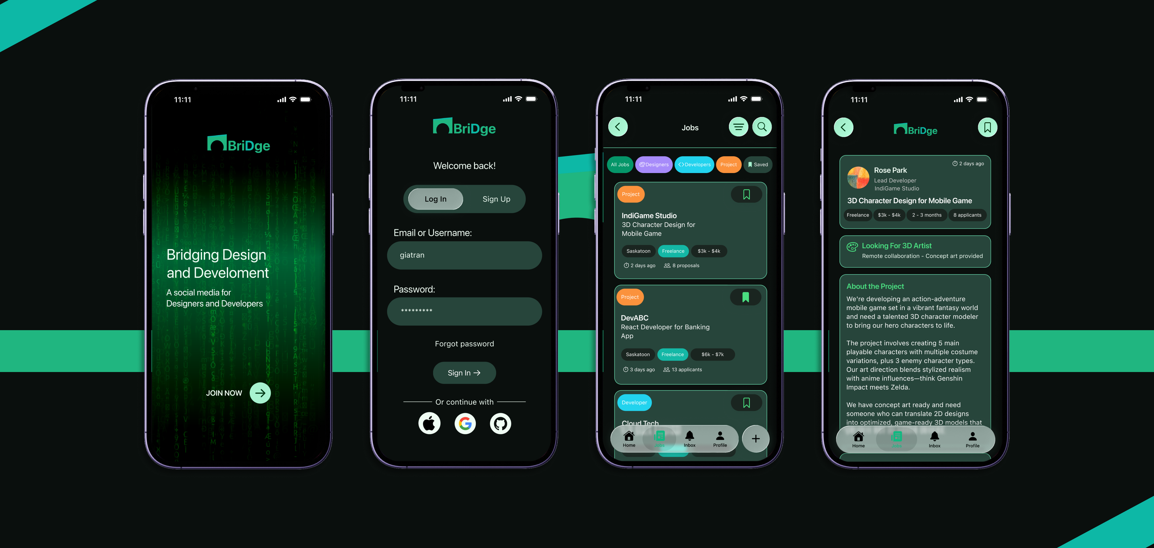
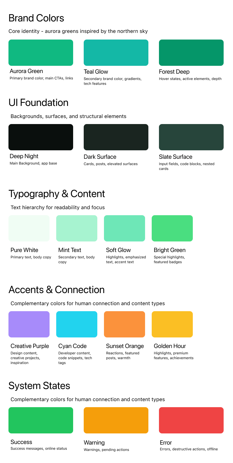
Design Decisions
- Dark mode first: inspired by how designers and developers work in dim environments
- Green accent: a nod to the glow of code editors and terminal screens
- Rounded corners + soft spacing: to create a calm, approachable feel
- Minimal icons: to reduce visual noise
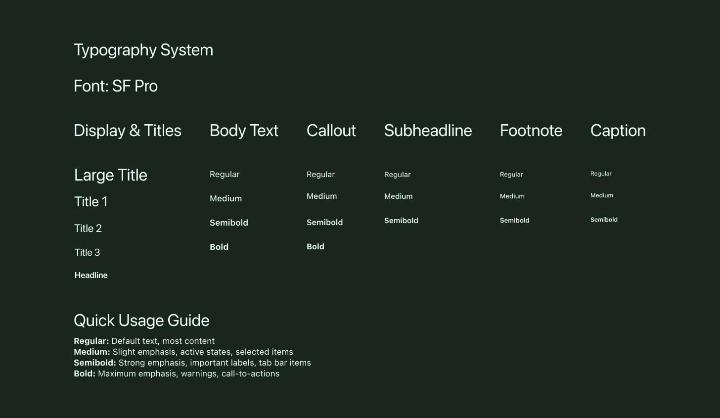
- Simple typography: lean, readable, and modern
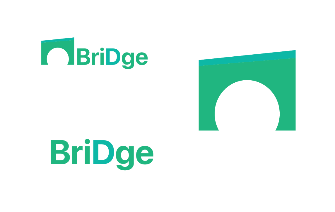
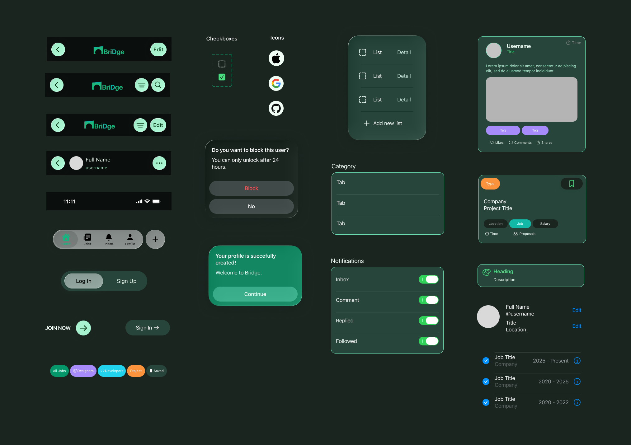
Logo
A simple mark relating to a bridge graphic with the app name using SF Pro font, easy to read at any size.
UI Kit
I created a UI kit using Apple's Human Interface guidelines and the iOS library on Figma Community, targeting an iOS-native design. You can zoom in to see the texts clearer.
After refining the visuals and interactions, the final prototype is complete and available to explore below. You can click the Figma icon to view it on Figma, or interact with it directly here.
*Note that some features are not fully implemented due to time constraints, but the core experience is represented.
Goals
- Assess how clearly users understand and navigate the main sections
- Validate whether the dark-mode-first approach feels comfortable
- Observe how introverted users interact with the feed and whether it feels emotionally safe.
- Identify which features users naturally gravitate toward and value most
Testing Tasks
- Go through the sign‑up and log‑in flow to see whether the process feels clear and easy to follow
- Browse the feed and interact with any section that interests you
- Switch between interface elements (e.g., tabs, buttons) to evaluate comfort and clarity
- Explore the job section and check whether each posting is easy to read and understand
- View a user profile and note whether the layout feels comfortable and approachable
- Describe how the color palette and interface make you feel while navigating the app
Key Takeaways
- As participants moved through the guided tasks, several moments of uncertainty surfaced, particularly around onboarding and navigation
- Several friction points surfaced during specific tasks, highlighting opportunities to simplify or clarify UI elements
- Participant feedback directly informed the next iteration, shaping clearer navigation, calmer visual hierarchy, and more supportive interactions for introverted users
- Reactions to the color palette and interface provided valuable insight into how well the design supports a calm, introvert‑friendly experience
What I Learned
Bridge started as a personal idea, a networking space for people like me who prefer quiet, intentional interactions. Designing it pushed me to think deeply about user comfort, visual clarity, and the emotional experience of using a social app.
Even though I couldn't complete every feature, I'm proud of the foundation I built. This project helped me grow as a designer, especially in UI kit creation, visual direction, and understanding the complexity of social platforms.
Challenges
Next Steps
The next phase involves testing the updated user flows with a broader group of participants, completing the descoped screens, and moving toward a higher‑fidelity build that could evolve into a more complete version of Bridge.