Find Me Something to Cook is a recipe‑finding web application originally built with basic HTML, CSS, and JavaScript. I rebuilt the entire project (from my school assignment) using React to improve structure, scalability, and functionality. The goal was to transform a simple recipe search tool into a more dynamic, component‑based web app with improved styling and user experience.
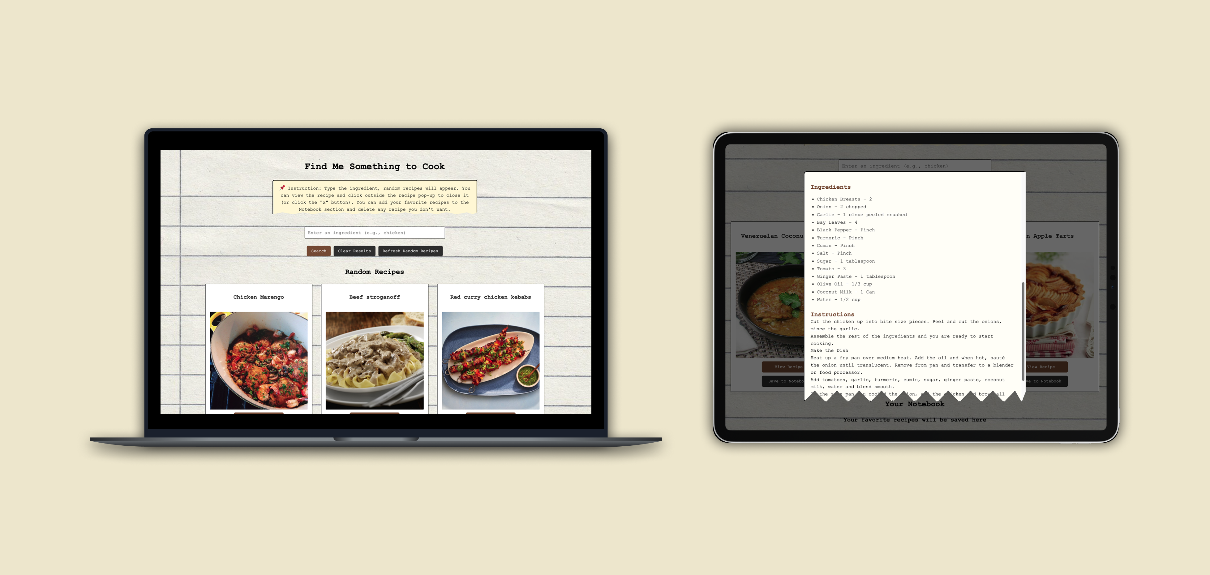
The app uses TheMealDB API to fetch recipes and displays them as interactive meal cards. Users can browse meals, view detailed recipes, and save dishes to a personal notebook.
The original version of the app worked, but it lacked structure, reusability, and modern UI patterns. As the project grew, managing JavaScript files became difficult, and adding new features required repetitive code.
You can view my previous version on GitHub:
Find Me Something to Cook V1 →How to build the recipe finder using a modern framework so the app becomes easier to maintain, expand, and style, while keeping the interface simple and enjoyable to use?
Before migrating the project, I reviewed
- React documentation
- Examples of component‑based recipe apps
- Tutorials on modals, state management, and API calls in React
- Some competitive app: Cookpad, SuperCook, MyFridgeFood, Tasty, AllRecipes, and TheMealDB Demo
Key Insights
- Many recipe apps offer powerful search tools, but their interfaces can feel cluttered or overwhelming
- Ingredient‑based apps like SuperCook focus heavily on utility but lack warmth or visual personality
- Several competitors redirect users to external recipe pages, disrupting the browsing flow
- Most competitors prioritize quantity of features over simplicity, leaving room for a more minimal, user‑friendly approach
- There is an opportunity to create a recipe app that feels personal, visually inviting, and easy to use, especially for users who want quick inspiration without navigating heavy interfaces
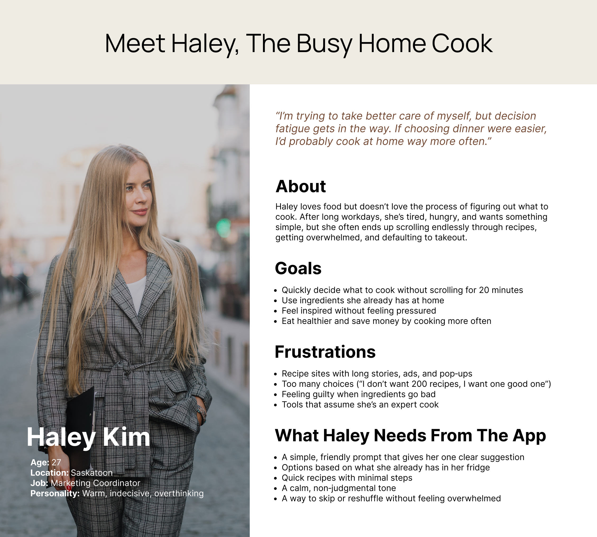
Exploring User's Scenarios
Research showed that users often felt stuck choosing what to cook. They wanted quick, simple ideas but were overwhelmed by cluttered recipe sites, long instructions, and too many choices. These patterns informed the personas for this project. I used "How Might We" statements to list some questions and selected the best ones to focus on:
How might we make choosing a recipe feel easier and less stressful?
How might we show users meals that fit their habits and preferences?
How might we help users make confident decisions without endless scrolling?
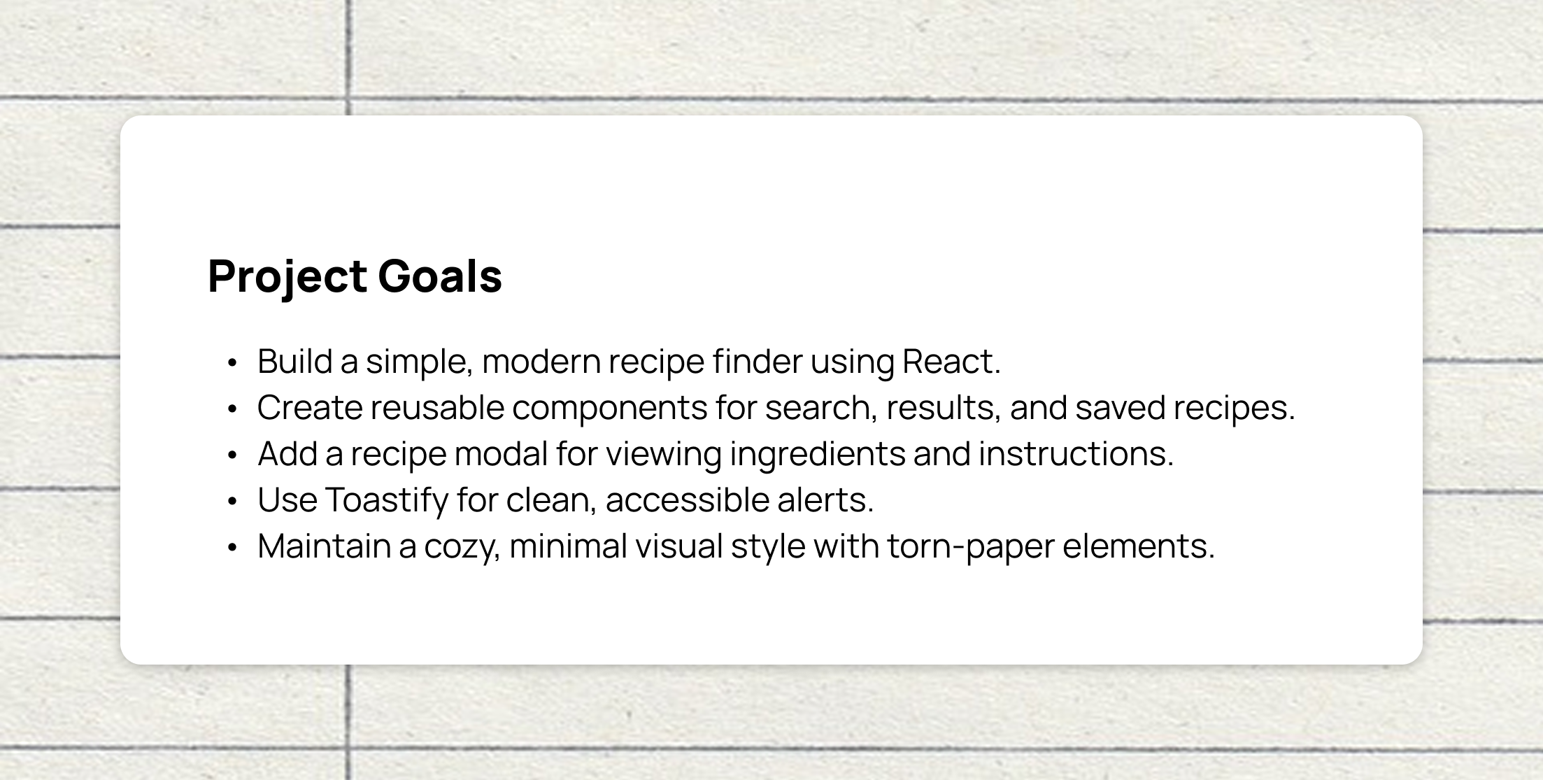
I mapped out the components needed for the React version:
Core Components
- MealCard.jsx: displays a single meal
- MealList.jsx: renders all meal cards
- RecipeModal.jsx: shows ingredients + instructions
- Notebook.jsx: stores saved recipes
- App.jsx: main container includes search bar
Supporting Files
- api.js: handles API calls
- index.css: global styling
- Toastify: for alerts and notifications
This structure made the app more modular and easier to expand.
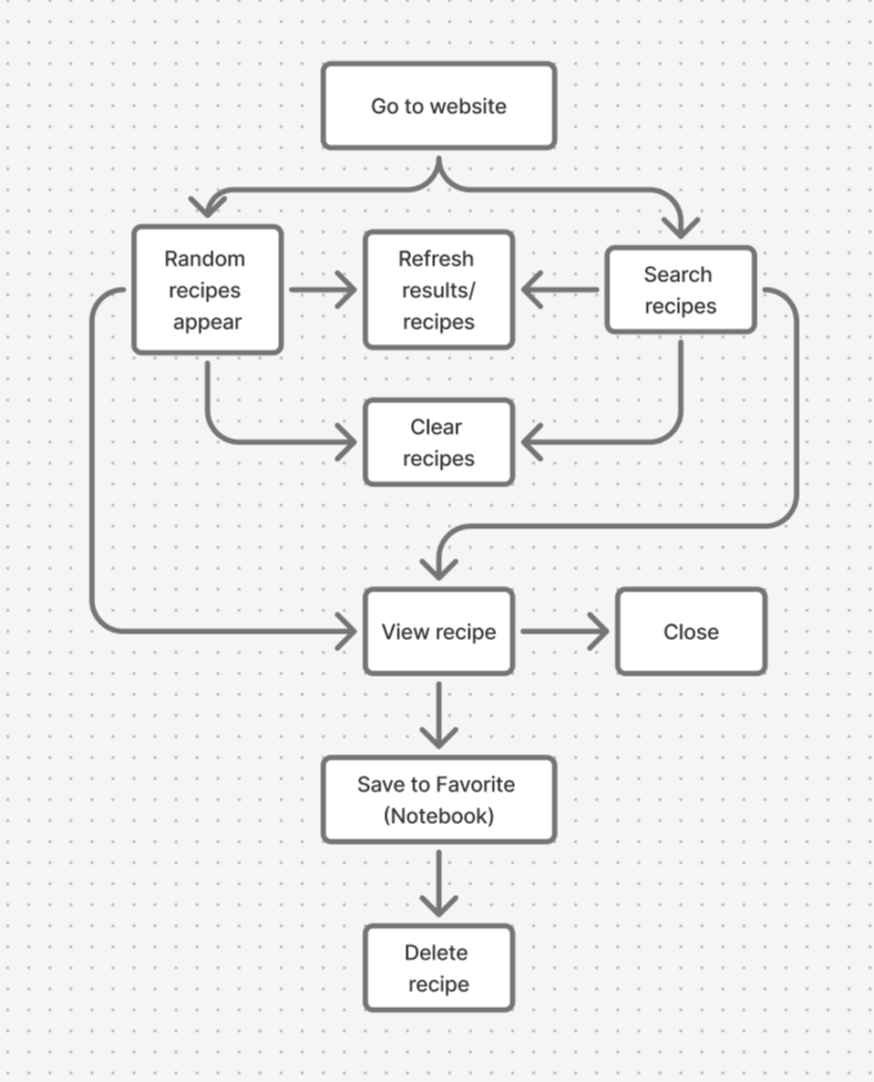
I mapped out the core user flows needed, focusing on keeping interactions simple, predictable, nd low‑effort, helping users quickly find recipes, view details, and save meals without feeling overwhelmed.
- Random recipe section, reload whenever refresh the site
- Search bar to use any ingredient to search for the recipe
- A recipe result section
- A recipe card to view the ingredients and instructions
- A favorite section
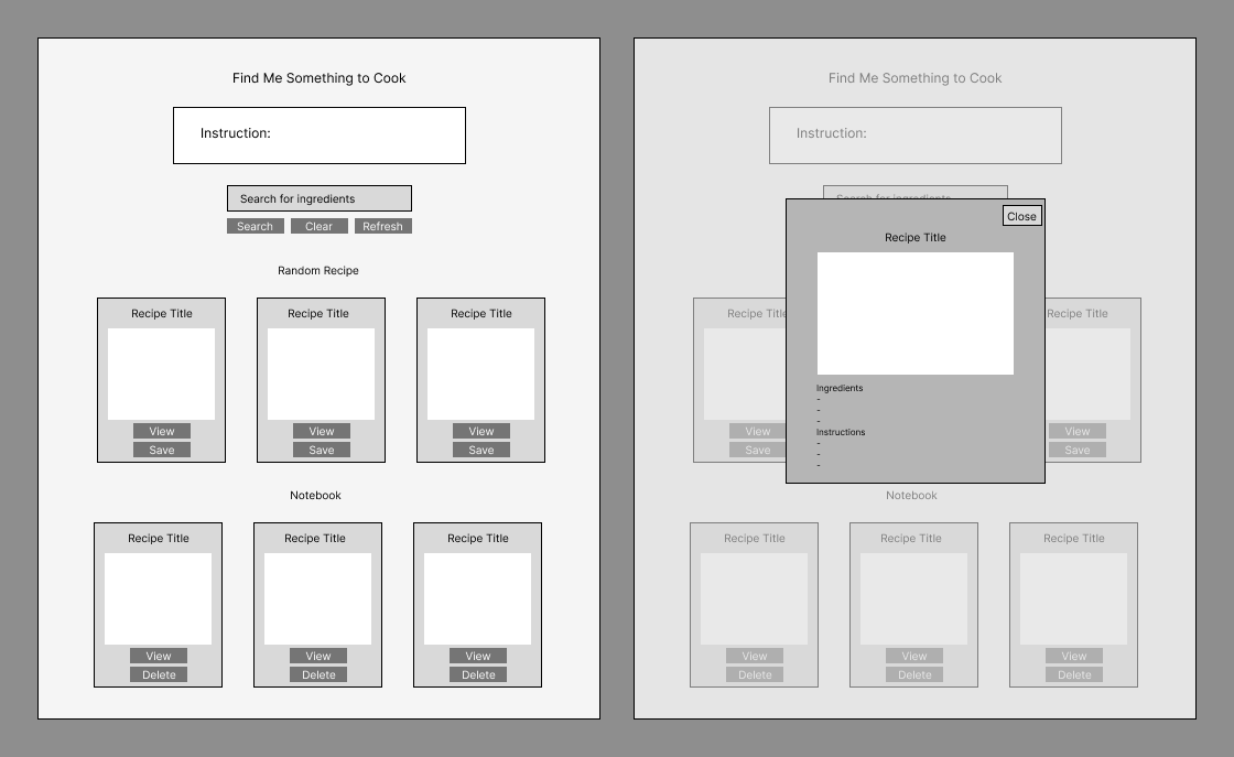
I sketched simple layouts for:
- The search bar placement
- The meal card grid
- The recipe modal
- The notebook layout
The wireframes helped me visualize how components would interact.
Design Decisions
- Keep a minimalist look: users like the simple, friendly design
- Add torn‑paper styling: gives the app a cozy, scrapbook‑like personality
- Use consistent spacing: react components made this easier
- Improve contrast and readability: especially in the modal
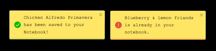
- Use Toastify for alerts: cleaner and more modern than default alerts
UI Enhancements (from the previous version)
- Softer shadows
- Rounded corners
- Clean typography
- Better spacing between cards
- Smooth transitions
The project is now fully built and ready to explore. You can view the final website in the link below:
Visit Find Me Something to Cook Website →Goals
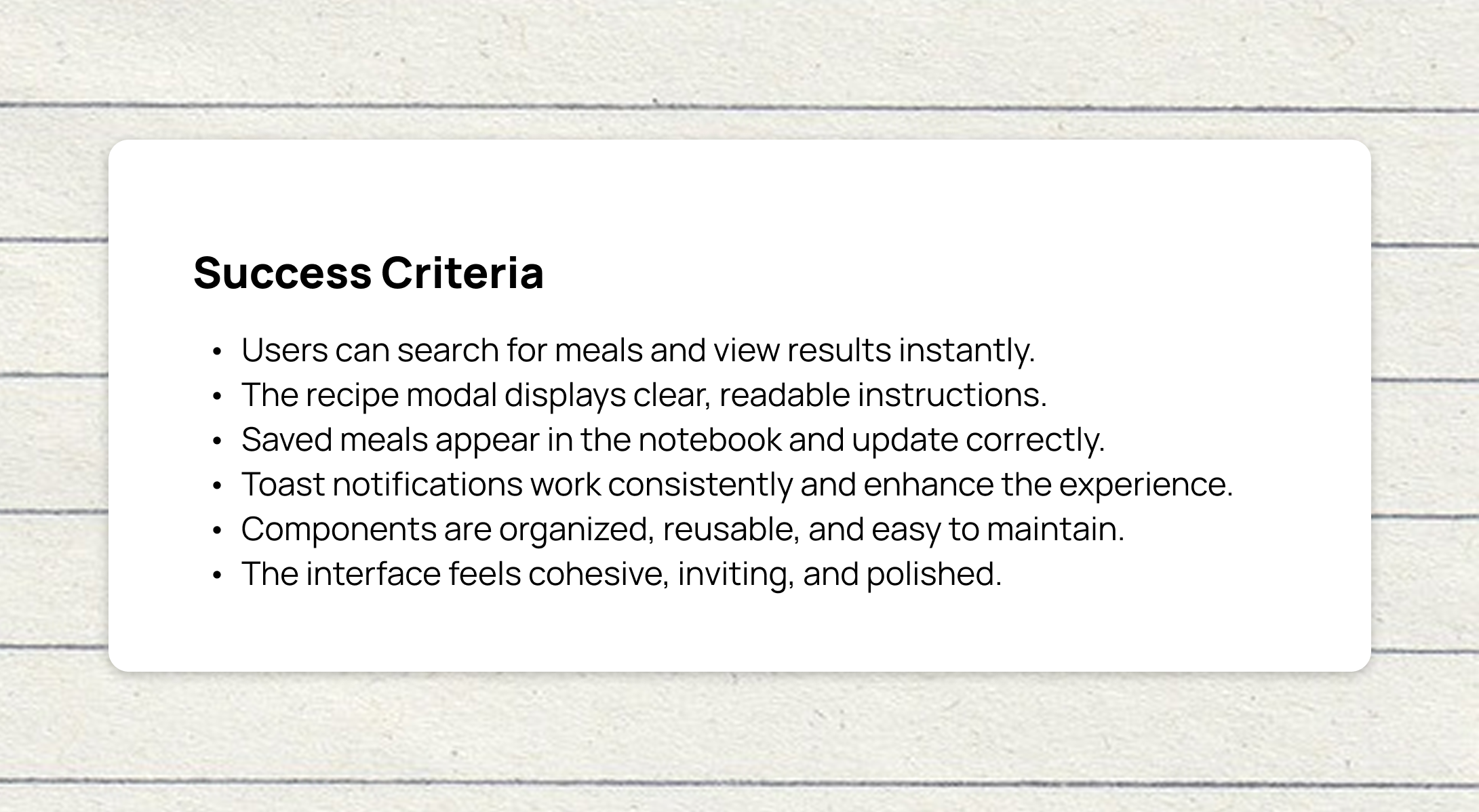
- Ensure users clearly understand how to save and manage recipes
- Evaluate how intuitive and easy‑to‑navigate the recipe modal feels
- Confirm that the notebook layout is readable, organized, and effortless to browse
- Observe how smoothly users interact with the search bar and whether it supports quick, confident searching
Testing Tasks
- Save a recipe you find interesting
- Open a recipe and explore the modal content
- Locate your saved recipes in the notebook
- Use the search bar to find a meal by name
Key Takeaways
- Users understood the save feature best when the icon or button provided clear feedback, confirming that visual cues are essential for interaction clarity
- The recipe modal felt intuitive when information was well‑organized, showing that layout and hierarchy directly affect comprehension
- A simple, structured notebook layout helped users navigate their saved recipes without confusion, reinforcing the value of clean information architecture
- The search bar was easy to use when it responded quickly and provided immediate results, highlighting the importance of responsiveness in search‑driven interfaces
What I Learned
Working on Find Me Something to Cook in React was a surprisingly enjoyable experience. At first, I felt unsure about how to begin structuring the components and organizing the logic, but once I started breaking the app into smaller pieces, everything became much clearer. I already had a solid understanding of how the original version worked, which made it easier to rebuild the functionality in a more modern and organized way.
Seeing the final version of the app made me genuinely proud. The React version feels cleaner, more interactive, more polished and easier to deploy with the opportunity to expand in the future than the first version. This project helped me deepen my understanding of component‑based design, state management, and modern front‑end development. Overall, it was a rewarding experience that strengthened both my technical skills and my confidence as a developer.
Challenges
Next Steps
Looking ahead, I want to continue expanding Find Me Something to Cook by adding more advanced filtering options, such as sorting recipes by category, region, or ingredients, and responsive in mobile screen. I also plan to enhance the notebook by introducing folders or tags to help users organize their saved meals more easily. Improving the recipe modal with subtle animations and transitions would make the experience feel smoother and more engaging. To make the app feel more polished, I’d like to incorporate loading states or skeleton screens, and eventually improve accessibility and keyboard navigation so the app is more inclusive and user‑friendly.